Brightwater
Canada
Rebrand
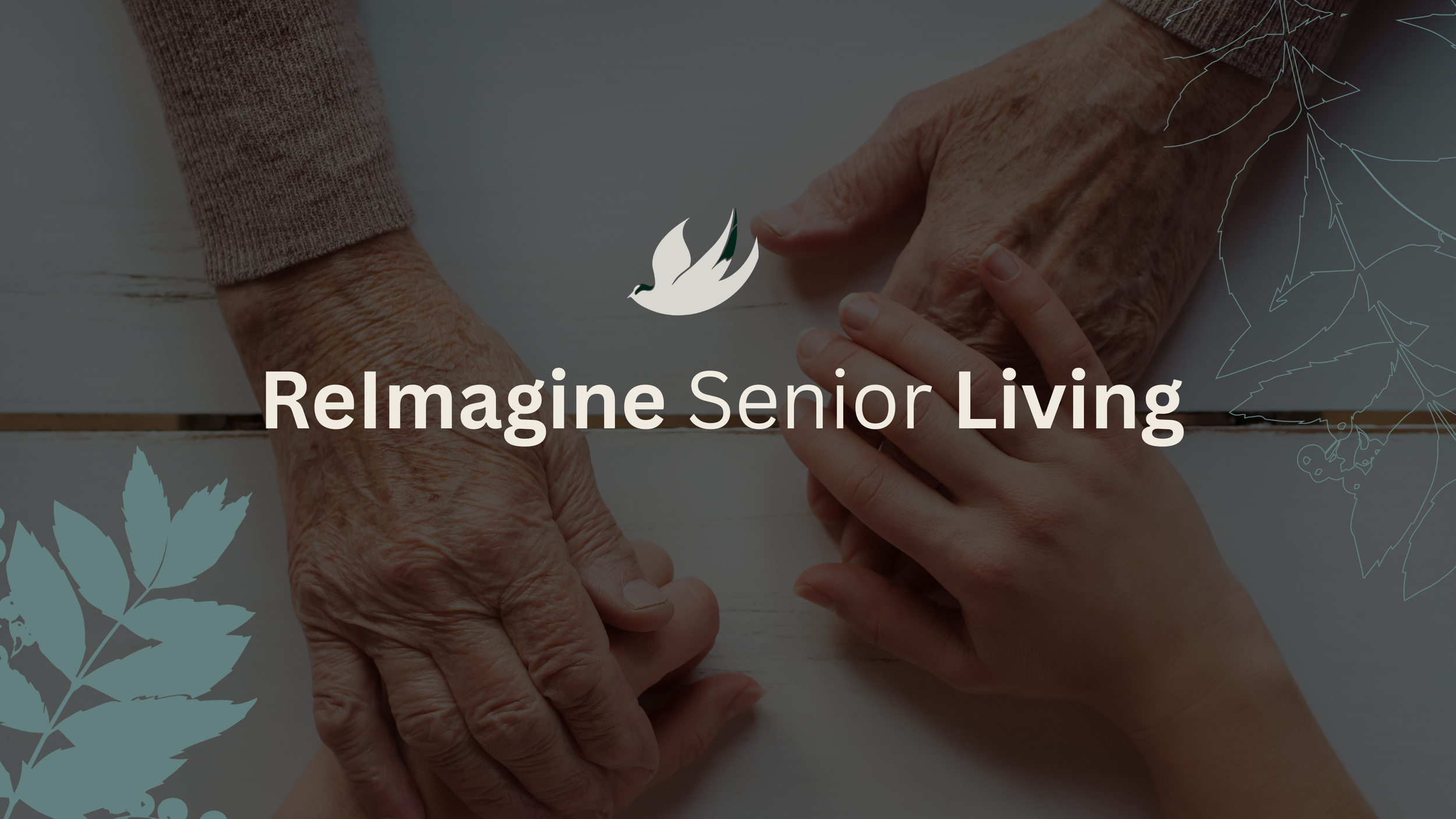
The Opportunity
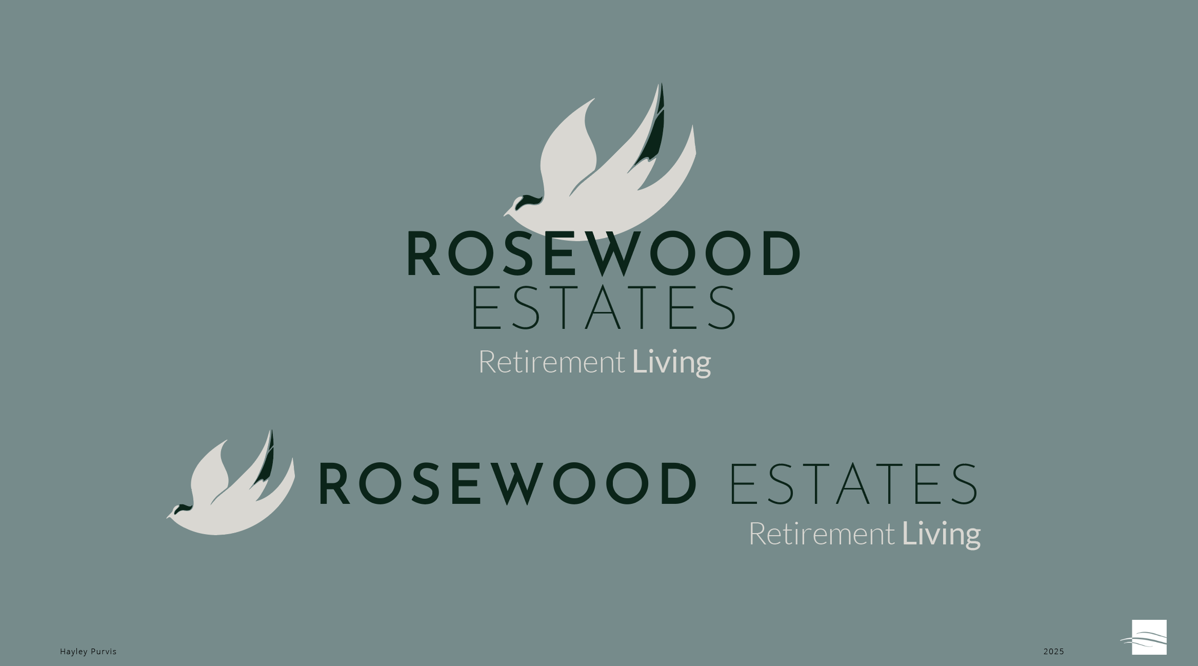
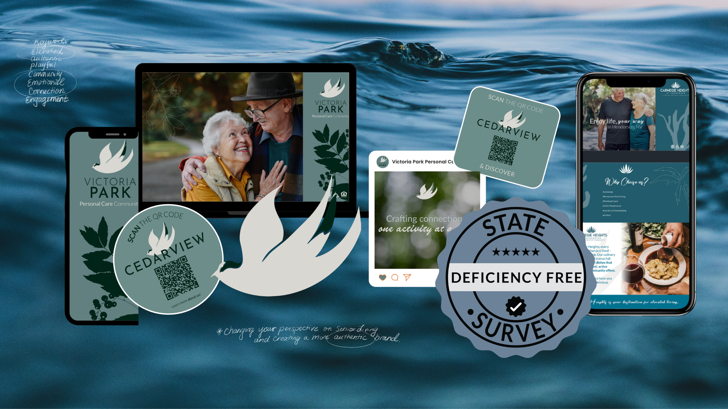
Brightwater tasked me to lead the rebrand for 6 of their Canadian properties to move beyond the red maple leaf imagery and refresh their brand to reflect a more welcoming, elevated, and community-driven experience of senior living, while keeping the spirit of Canada alive.
The Idea
I introduced the Canadian Grey Jay as the new symbol. Combining everything playful, authentic, and distinctly Canadian. This logo mark represents joy, connection, and the spirit of authentic living and elevated style, embodying Brightwater’s tagline, Living Your Way
The Outcome
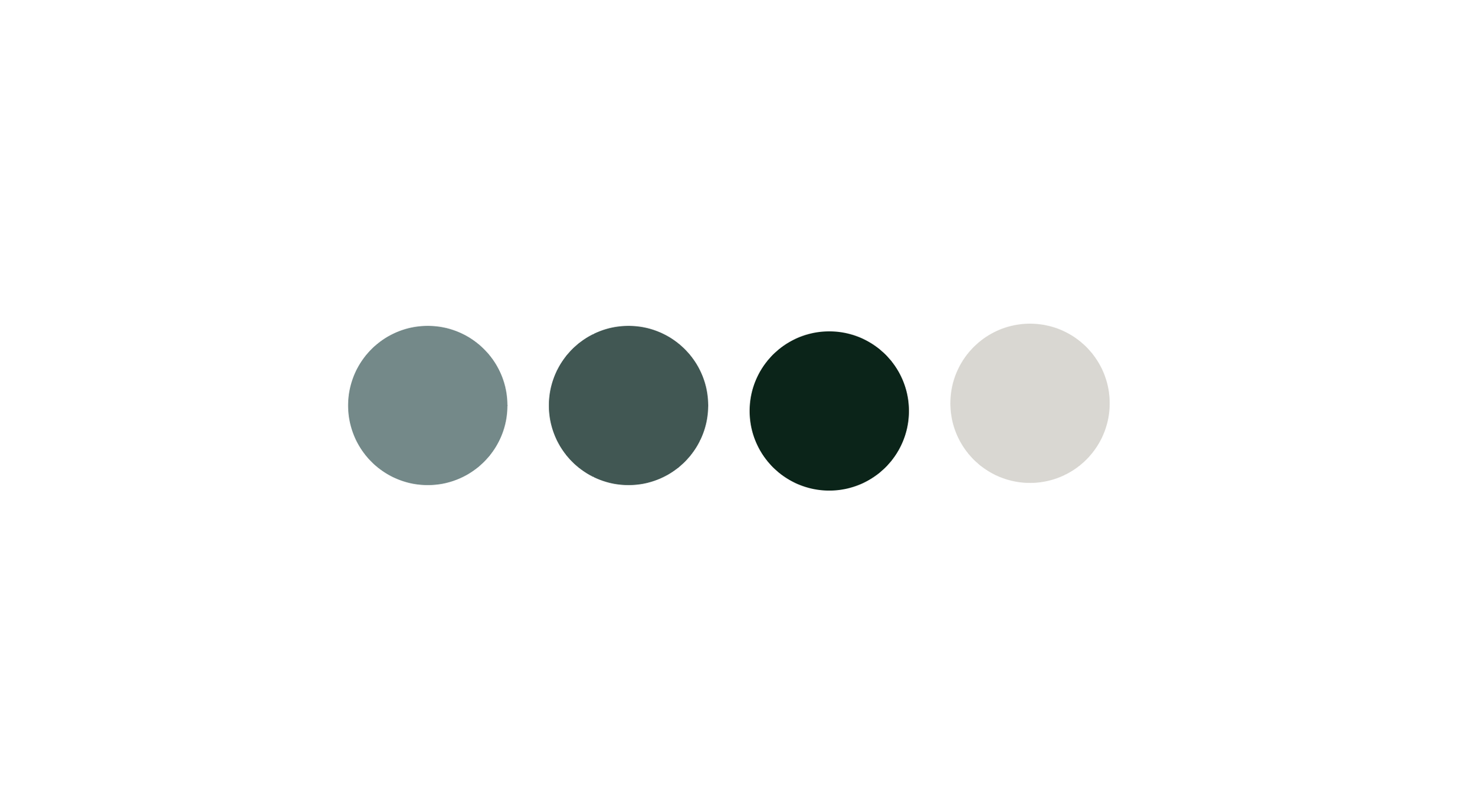
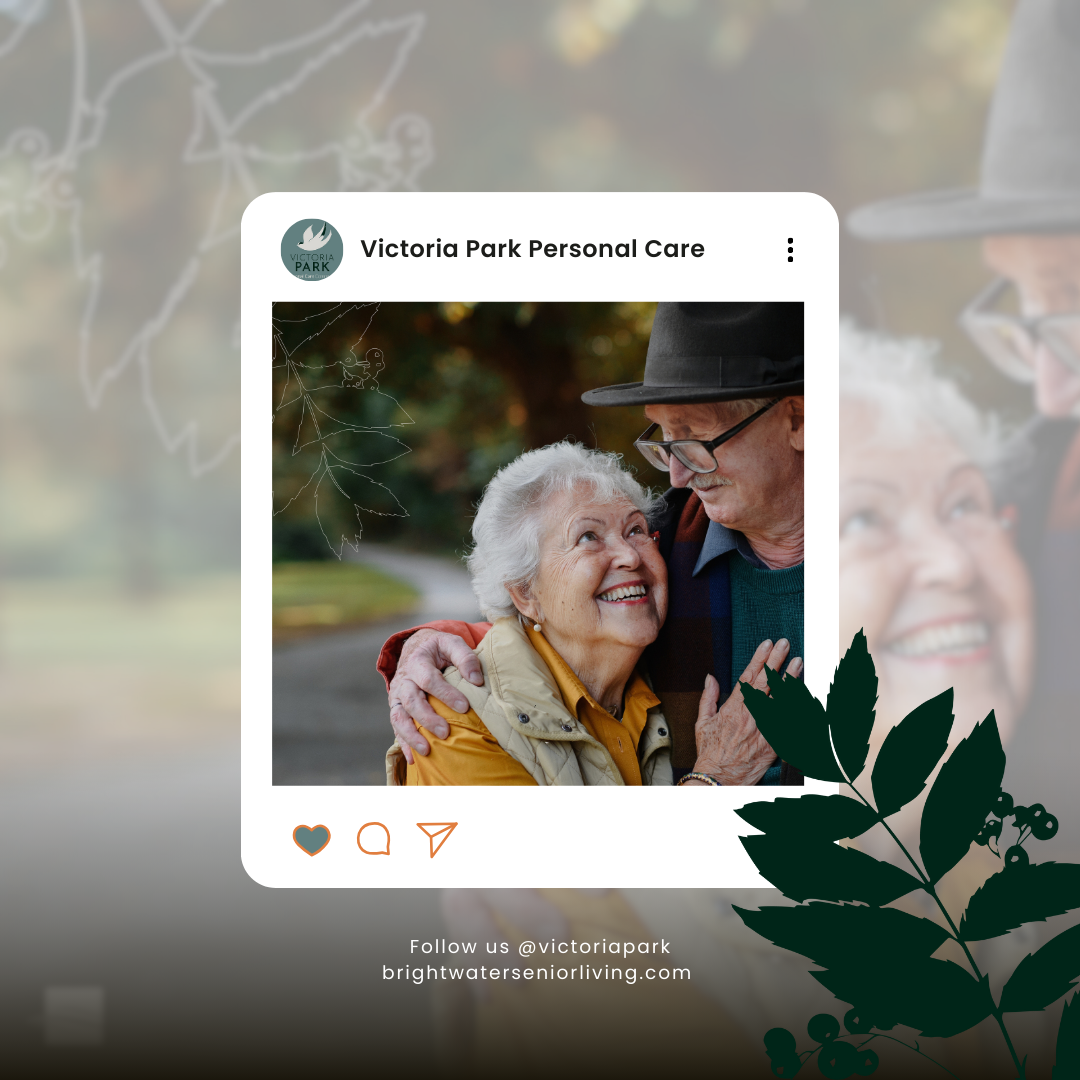
A brand that shifts perceptions of senior living: from institutional to authentic. With a calm yet engaging color palette and a focus on hospitality and community, Brightwater’s Canadian portfolio introduces a new identity that invites people to see senior living in a whole new way.


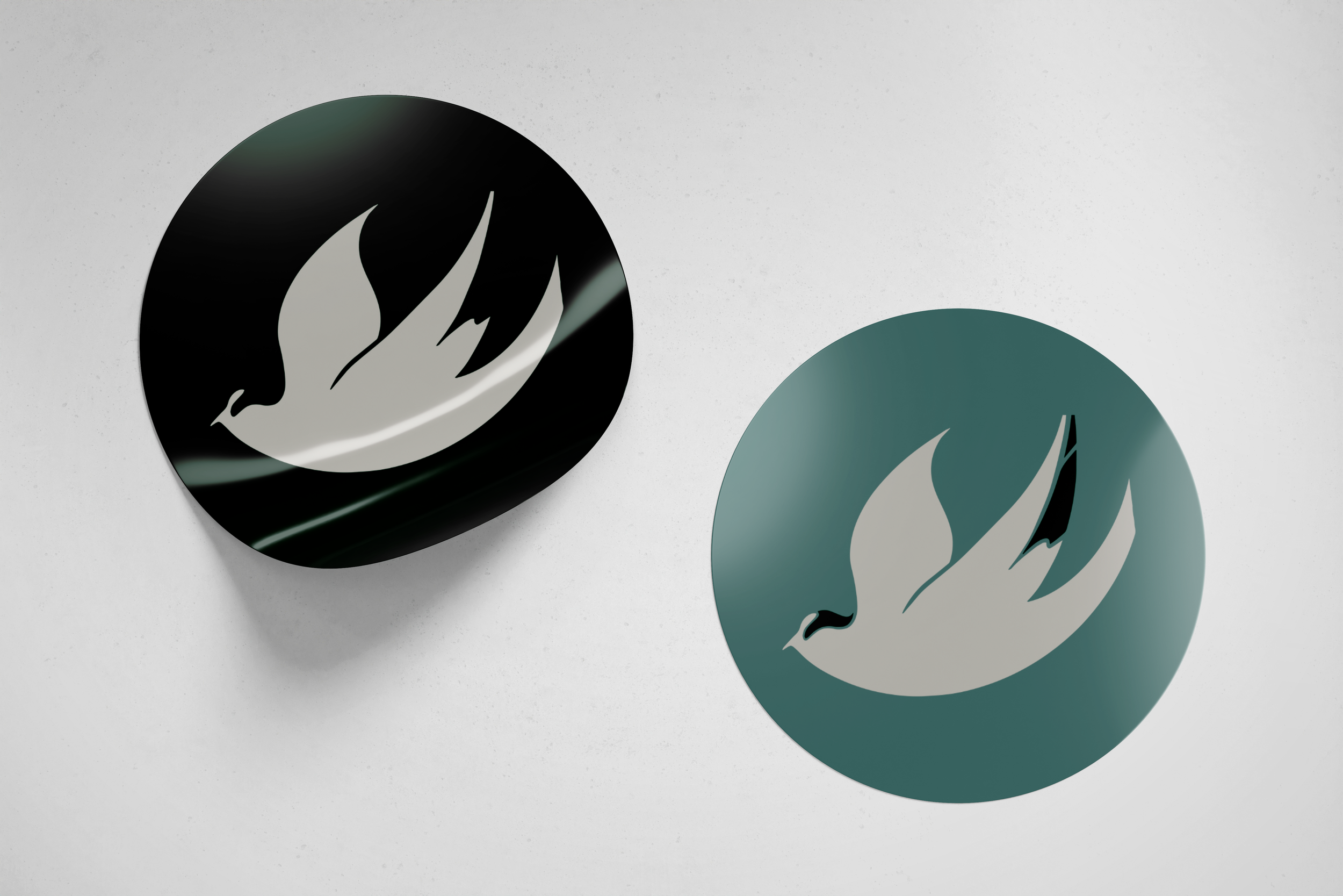

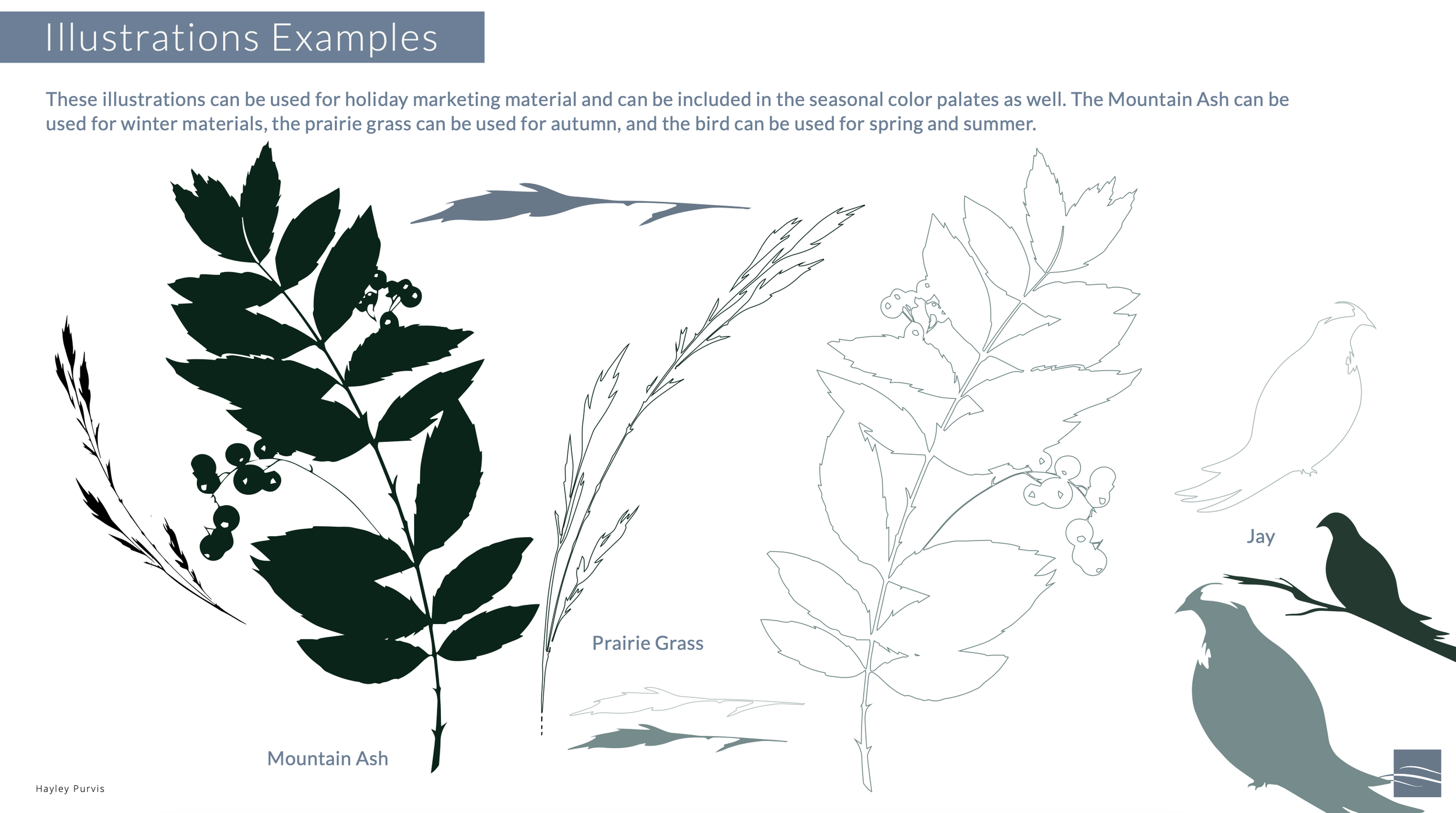
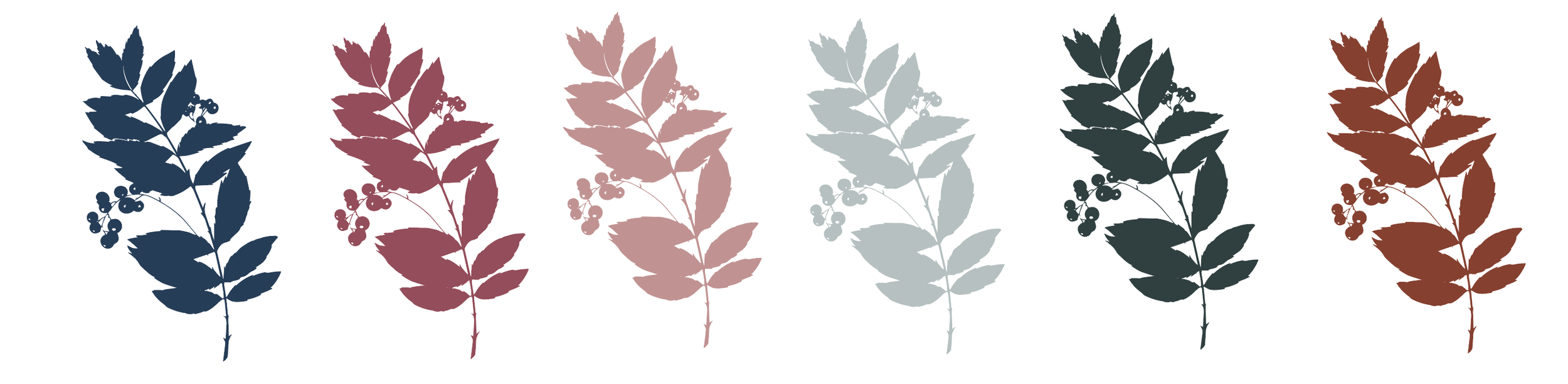
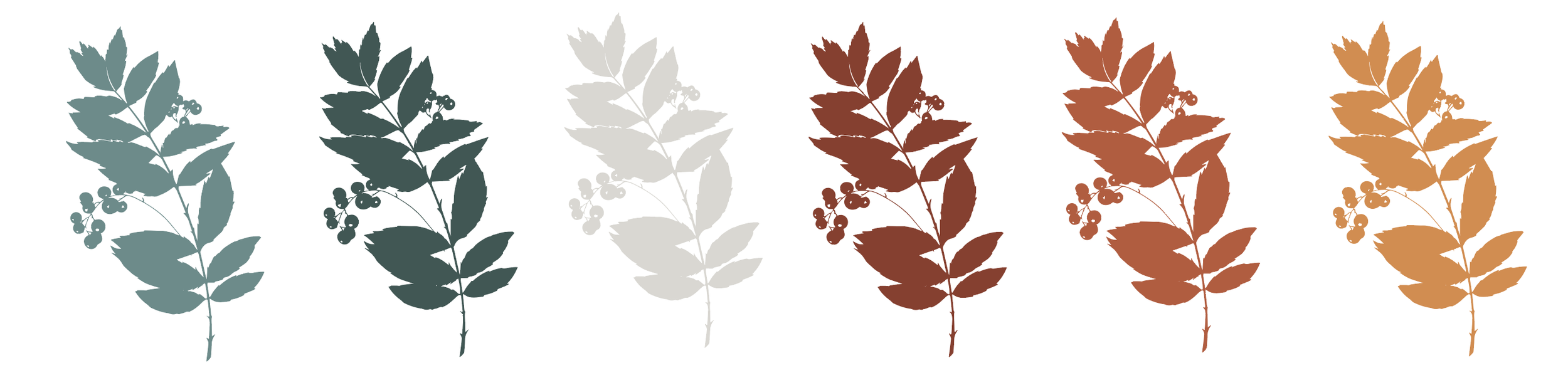
My goal for these illustrations was to showcase warmth and a delicate nature.